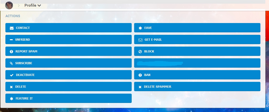
Due to the responsive template we can not place action button of profile at the bottom of the profile in mobile version. So if a user see a profile on mobile, action buttons need to be as close to the top as possible. if we place them there, we get these big buttons. which look horrible for desktop view. They need to adjust according to the width of the block.
Umar Haroon |
My actions block looks fine on desktop and phone. Your description of this supposed problem is as clear as mud. To me it sounds self-inflicted. Why would you put the actions block in a wide, or full width column? I don't get it. My opinions expressed on this site, in no way represent those of Boonex or Boonex employees. |
You didn't get it thats why you saying it. When you visit other members profile on mobile, where would you prefer the action buttons to be? After the timeline or above it? If it is below the timeline then you have to scroll all the way down to perform a simple action from the buttons. Reason i put it right below the cover is, for the convenience of the users so they can easily browse profiles and easily fave, befriend, message, chat etc without the hassle of browsing all the way down. This way its more handy for mobile users. Only solution for responsive dolphin.pro is to add more rows in page builder. It will give the opportunity to admins to adjust the width of blocks within those rows. Umar Haroon |
When you visit other members profile on mobile, where would you prefer the action buttons to be? After the timeline or above it?
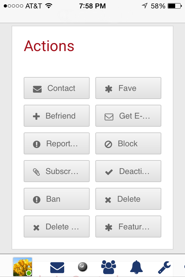
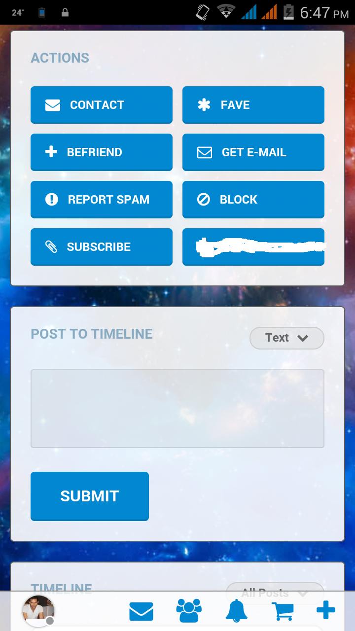
OK, here's a screen shot of my actions block on the iPhone as it appears directly below the profile cover.
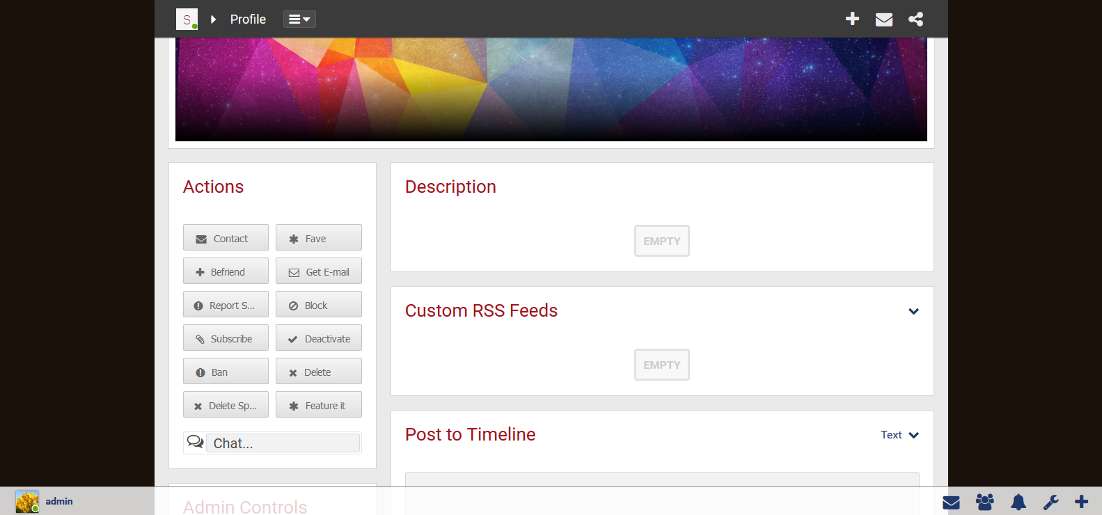
Here it is on the desktop.
My opinions expressed on this site, in no way represent those of Boonex or Boonex employees. |
Only solution for responsive dolphin.pro is to add more rows in page builder. It will give the opportunity to admins to adjust the width of blocks within those rows.
Bullshit. If you put it as the first block in the left column, it's just fine.
My opinions expressed on this site, in no way represent those of Boonex or Boonex employees. |
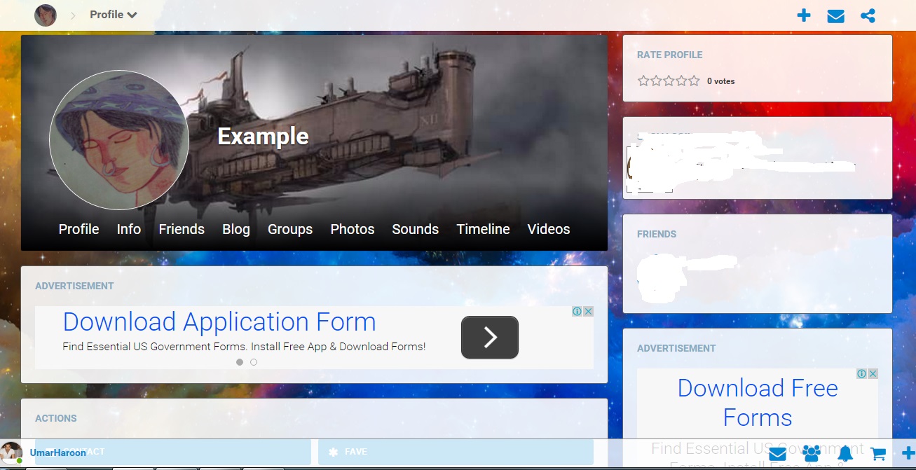
There is a difference in how you show profile and how i show. On my profile there are 9 active blocks in the slim column, i can't put them all before the timeline.
Umar Haroon |
So I was right. Your problem is self-inflicted. I wouldn't wait around for Boonex to change things to suit your own personal needs.
Why don't you just change the css for the actions block & buttons to accomplish what you need. There is never, ever going to be a one-size-fits-all template that adapts to everybody's personal preferences.
My opinions expressed on this site, in no way represent those of Boonex or Boonex employees. |
Point is the current dolphin profile is responsive but for mobile users its less handy. I made the profile this way to make it more user friendly. Umar Haroon |

