Member Menus in DolphinPro 7.2

Andrew Boon posted 11th of May 2015 in Dolphin.pro News. 19 comments.

In DolphinPro 7.2 development we are particularly focused on improving overall usability of the platform. Quite simply, we want end-users to be able to enjoy networking and sharing instead of trying to figure out how the site works. And the most crucial "driver" of good user experience is, of course, navigation. We spend a whole lot of time figuring out navigation. Today, we're sharing our latest vision of member menus in 7.2.


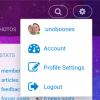
The main member menu is quite simple and includes only links to profile, account (dash), settings and logout. This is the absolute spartan minimum. Since this menu is now a vertical popup web-masters can add additional items via menu builder without any trouble or fear of running out of space on small screens. Even "small" smartphones in portrait mode should feel adequate with such a compact menu. We are still working on the new look for "Search", which is likely to be closer to that in Trident. Other items that you may expect (such as Notifications, Friends, Messages, etc.) are to be displayed in the floating menu at the bottom of the page (it can be configured to show on top, too).  


Floating menu has also been redesigned. Trigger icons rearranged and menus improved. Status update has been merged with "Add New" menu, so posting new content and shouting out your ephemeralities happens from one place now. 

Notifications and Messages snippets will still remain in Floating menu, but chat-tabs will have to move, since they can't be properly accommodated by small screens. We're considering different options for that (chat-heads, anyone?), so ideas are most welcome.


On the left side of the floating menu there's still the "Presence" switcher that changes visibility status. 

So, what do you think? Hit or miss? We are open for your ideas, suggestions, emotional outbursts and weighted critique. Speak up!


Recommended by
 
 
Comments
·Oldest
·Top
Please login to post a comment.
namesbuying
That's just exactly what we need. And, for the chat, just to be created in the same idea as "add new" but instead of group, events, sounds,... etc the members' nicknames who you have active chat with plus close icon or something like window taps to shift between more than one chat window window.

Regards..
daihlo
related - the main nav menu, can this be made (admin option?) to 'stick' to top of screen as user scrolls down?
Andrew Boon
We are now experimenting with some submenu improvements. Since it has navigation within chosen modules and action buttons it may be a better candidate for "sticky" option.
mrtn
How will be the transition from our version to this new version? What about all the modules we have installed? The new design looks good. Is it only a template we have to use, or will this be a hell of an update?
Andrew Boon
7.2 should be a smooth update. All these changes are in a new template, which should work fine with most extensions. There're going to be a number of bug fixes and various improvements, but nothing beyond ordinary.
EagleII
You could sell "Insurance" to the unsure uninsured user. If the install is pooched, insurance will cover a fix. All they need do is sing that tune, "Like a good neighbor.." and poof.
( Geritol - Making Old Guys say strange things )

Joe
Over 67 years on the planet and still having fund
mrtn
Is there a new release date? We are longing for those changes. Especially responsive design.
EagleII
I keep looking for a link to the Beta to play with.... must have missed the boat.
Andrew Boon
There is no Beta for 7.2 yet. We have a few more improvements in works right now and some bug-fixes. Beta should come out in 3-5 weeks.
EagleII
Thanks, look forward to playing in that sand box.
EagleII
If I'm still alive... won 't know if we can play from the grave till I get there.
Andrew Boon
We hope to bring out the first beta in 3-5 weeks. Working on it now.
mrtn
Can we test it then on your demo version?
moonsoon2u
I feel account need to be separated from member menu cause account brings the news feed of friends and whom you follow. So it should be 1 click away. Extra things in account need to moved in member menu along with presence switcher, so at bottom we can have more space for chat tab. I think 3 tabs are used more than any. 1 Home, 2 account 3 chat. In this way it will be more simple.
Eli
I had quick look at the demo on newton site, and i disagree completely with the top menu ! i like :
Your Porifle
Account
Profile Settings
Logout
And the search

And i would like to see same on left side but for the top menu , instead of having again that long bloody menu, have you guys looked at the Social engine , it's easy and simple to use , why not 7.2 will have something for the menu that will be just a button click and drop down menu instead of Repeating the MENU TWICE ! I think no see more need for that !

People love simplicity !
mrtn
can you give us the link? So that we can look, too. Thank you.
Eli
check this streetlife.com made by social engine and see how it looks from inside
 
 
Below is the legacy version of the Boonex site, maintained for Dolphin.Pro 7.x support.
The new Dolphin solution is powered by UNA Community Management System.
PET:0.066494941711426