OUTLINE - The New Masonry-Grid Content Browsing in Osho

Andrew Boon posted 10th of September 2012 in Dolphin.pro News. 65 comments.

Yes, it is Pinterest-inspired. Yes, a lot of sites do it right now. Yes, we're going to do it, too. Yes, this is the "secret new feature" we were referring to. Yes, it is really cool, effective and important, and here's why...


Outline is a new content browsing feature in Dolphin 7.1 Osho that uses Masonry-grid layout system to display site's content as a mix of tiles that "float". It rearranges and repositions all the child elements next to one another. When you resize the windows, child elements are being realigned to the right position. Turns out that when coupled with infinite scroll this is a very engaging way to display content. I'll quote Nir Eyal on this one...


Few other methods for displaying information produce the curiosity to see what’s next like the infinite scroll. Like coffee and chocolate, the infinite scroll pairs particularly well with another increasingly-used design pattern, the masonry grid layout made famous by Pinterest. Cliff Kuang, editor of Co.Design, wrote, “… the Pinterest-style grid forces the eye to zig-zag through content, slowing down your scrolling but packing more images onto the screen at any given point.”

The barrage of enticing content speeds users up, enticing them to scroll, while the grid slows them down, retaining their attention and moderating their thirst for more and more stimulation. The visual tension is mesmerizing and addictive. Don’t believe me? I dare you to go to the Pinterest homepage and not feel tempted to scroll just once. It’s like opening a can of digital Pringles.


We decided that this new browsing "trend" suits Dolphin structure very well. It may be difficult to display interesting pieces from different modules on one page without over-complicating the layout. Surely, you can have separate blocks for each module - photos, videos, blog posts, etc., but this isn't a natural content flow. Like in real life, we normally don't separate media types when consuming content - we talk, watch videos, photos, listen to music and read notes in a mixed order, often simultaneously, and normally without pre-defining media types. We're interested in a certain TOPIC, and then we just consume content about it in whatever form it comes. Dolphin-based site niche largely defines the topic, while the new OUTLINE exposes a mix of content, with an opportunity to infinitely scroll and browse through it. In short - it's a perfect fit.


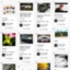
Here's how it looks:


Clicking "Load More" will load an additional set of tiles without reloading the page. As you may see content comes from different modules, marked with module icons accordingly.

Tiles will adapt to your preferred block width or to fluid site layout, so the Outline may look like this...


Naturally, you can elect to use it only in one of the blocks, mixing it with other blocks like "Featured Members", "Site Stats", or whatever, but the coolest thing about Outline is that it is perhaps the only kind of "site window" that can be used without any other blocks and still give a broad overview of what's going on. It's a great attention-grabber.


Outline is a part of Timeline module. Same as with the Timeline you can control it via Admin panel and can choose which modules would be used to display content in the Outline...


3rd-party module developers would benefit from acquainting themselves with how to integrate with the new Timeline/Outline module, since it really is poised to become an integral part of Dolphin platform, just as "masonry-grid" is quickly becoming a new standard for mixed content browsing layouts.

 
Recommended by
 
 
Comments
·Oldest
·Top
Please login to post a comment.
rhimpr
Looks great..Like the look and layout to make it easier for users to browse site info..
newton27
Yes, looks great! Off to do a new install.. Thanks for the hard work, it really shows!
what exactly does this mean:

Naturally, you can elect to use it only in one of the blocks, mixing it with other blocks like "Featured Members", "Site Stats", or whatever, but the coolest thing about Outline is that it is perhaps the only kind of "site window" that can be used without any other blocks and still give a broad overview of what's going on.
Andrew Boon
This means that although the new Outline is what we think is preferred way to display content, it's by no means the only way to do it. You can still build your site homepage to have all those individual content blocks.
zugul
hi mr. andrew
you already have a date for the official beta version?
zazazaza
Hi Andrew! The stuff looks nice - anyway it seems to be the new trend in web interfaces. 1) Could you make the piles "float" following the screen size 2) could you add buttons like: all, new members, videos, photos, sounds so that they would switch the content of piles displayed on the home page 3) those could be the round graphic category symbols placed now in the left upper corner of each pile. Alltogether that would give Dolphin some newer and fresher look and get rid of old school web see more 1.0 info flows. P.S. Joomla now is all about Responsive templates.
Expertzkris
Yes, it is Pinterest-inspired.

I can see it is at first glance..:) nice update.
zugul
really nice
look with confidence to the first beta version to start upload content and test
surely the 7.1 will be a success,
shnelson
Very nice! Now, If only the forums activity fed into the outline.... :)
daihlo
Very Very Very Very nice :-) !!!!!!!!!!!!!!
Been looking at integrating pinterest clones for a while now but this looks great!

One question... if I click on an item to view from within outline, does it
1 - open up the item in its own modules view page, therefore linking back only within that module (example I click on a photo in outline, view in as regular view photo page, but then are given back links to the standard photo mod but not outline..)

2 - open in regular modules view page but see more with additional link to go back to outline page...

or
3 - open a preview just of that item like a lightbox on the outline page still! (this would be nice option!)


either way, I think this will be a VERY useful feature...
Cant wait for the release date...!
thrivity
I surely hope is the 3rd options. Lightbox to additional info then links to specific content section would be preferred. Anyway, Outline is a great addition. Excited to get my paws on 7.1.
Andrew Boon
Outline is only 1-week old feature. It will only get better from now on.
thrivity
A proximity search would greatly compliment Outline. Members can search by location (city & state) then select with xx miles. Maybe, Boonex or a third party dev can add in the future.
I am looking for structure and not a everything-in-one-place.
Would have been excited and relieved if Dolphin delivered sub-categories in all media instead. Dolphin 8?
Megarick
It looks really great! Congrats to all and each ones envolved with this.

Andrew, I have one tecnical question? Dolphin is awesome, no doubt, but it is a heavy software and a memory leaker. With all those changes, do you think Osho will be more light?
Megarick
Since I got no answer I guess Osho will be so heavy as D7.9 or more.
AlexT
It should be faster - we get rid of almost all icons, plus graphics is almost 100% based on css styles.
Also there some improvements in templates cache engine when php accellerator is enabled.
Megarick
Thanks AlexT. It is great to hear that. Really!
Alan Stewart
I see the potential and appeal of Outline in the right Communities. However, it does not appear to be appropriate for sites that are both Community and Purpose driven. The free flow of experience in a pure Community is appealing. The loss of controled direction in a purpose orientated site is not.

Can the traditional location designations and the freedom of Outline be combined?

For us the free-flowing Outline on-its-own is not an appropriate element of our combined Community – Purpose see more approach.

We are very supportive of and impressed by the hard work and creativity that has been done for 7.1.....

Congratulations!
thrivity
I like the free flow of information, especially in the grid, it's very appealing and draws you into the page. I would like to see an option to simplify the discover of content (using ajax search) to filter through it easier.
mmm not sure if i like it! It seems messy and unorganized to be honest! I realize that this isn't the only way to have it layed out, but this new 7.1 is moving away from the idea of having a dating community website and more of a general "anything goes." Pinterest isn't that great, it's just a lot of feeds pulled into one page and hard to navigate around unless you have a massive monitor! Oh well, lots of CSS changes to do when it finally gets realeased.........one day!
newton27
The "Outline" is the only thing to me that is Pinterest.. that block as others, can be removed and the site will look similar to 7.0.9.
Andrew Boon
(repat answer) As noted, it is an optional kind of block, however I like to remind that it's also configurable. In our example we're pushing all kinds of modules updates together, which makes the Outline a little messy (which may actually be a good thing for user engagement for soem type of sites), but when you only turn on, say, photos and videos, or only, say, blog posts - it's neat and tidy.
Alan Stewart
I miss understood how it was being applied. Thanks for the clarification... Looking forward to experimenting with it.
freakpower
hmm dont like this idea at all. I dont like pinterest and i dont like its boonex copy. Its too much informations, chaoss and make from clean site total mess. I hope this feature can be turned off in admin area. Please andrew for those of us who strongly dont like it make it possible to turn off so we can get rid of that.. thanks
newton27
lol, wow guys... the "Outline" is a simple "block" it can be removed by dragging to the "Inactive" area. Your not required to use it.
daihlo
Its a page block so can be used or not by choice. Lots of uses for this sort of thing, opens up many options for using Dolphin in different ways...
Andrew Boon
As noted, it is an optional kind of block, however I like to remind that it's also configurable. In our example we're pushing all kinds of modules updates together, which makes the Outline a little messy (which may actually be a good thing for user engagement for soem type of sites), but when you only turn on, say, photos and videos, or only, say, blog posts - it's neat and tidy.
houstonlively
What's not to like about pinterest? Pinterest makes it easier than ever, to find completely useless information. All you 800,000 Dolphin porn site wannabees should love this... you'll have an infinite scrolling wall of weenies... you could call it 'WOW' for short.
Andrew Boon
I was wondering when would we hear a snarky remark from HL... :D
Diddy
I been looking for this one as well :-)
I love to read them :-)
daihlo
Feature request for this!!! or - ideas for developers...

1 - Click item to open lightbox display FIRST - with option to click + for full listing (kinda like quick preview)
2 - Add a BUY NOW or ADD TO CART button on any store items that are displayed in outline!
3 - Membership levels... admin control over what content related to what membership displays in outline. Good sales point for site membership...
4 - Maybe option to display featured items only? OR 2nd outline box for featured items see more only!
daihlo
I take it outline is based on RSS type feeds from modules right?
This approach to displaying content would be very nice in the search system...
I think the current search setup just doesnt look good at all, in fact I disable it on all my sites...

BUT - if you could filter / search content and it display in this format.. that would be great!
areavis
beta version will be available in this month?
vtreis
clean and attractive design.
the idea of ​​mixed window tiles is phenomenal.
I look forward to Implement this version.
nice work!
buzz_lightyear
Cool, is that already in SVN?
i've just synced and either i can't find it or don't know, how to enable it.
svn://svn.boonex.com/dolphin/branches/7.1

thanx
lol - still wanting to be positive - I have to say that I think this style of layout looks jumbled. If I saw a site like this - I'd presume a lack of care had been taken with the formatting and/or permissions given to users for the type/cropping of images. The basis of it looks good, but landscape & portrait images don't go well together in this way - and so it would be good to be able to make selections so that proper rows & columns can be maintained on the page. I'd really like to use dolphin see more (which equates to putting hundreds of hours of investment in on my part) however the main reservation I have at present is the quality of presentation. As it is - I don't think its basic presentation of text & images compares with Wordpress with a high quality theme & plugins. Dolphin is too bitty, the navigation between various elements too confusing & complex, etc. I am hoping very much this new release will address these kind of issues - however - I don't see the MG style achieves it.
thrivity
Regarding the Outline - Millions of people currently and enthusiastically uses pinterest would disagree. Also, as mention several times in the main topic and post responses; you have the option to use it or turn it off.
Hi thrivity, I appreciate the clarification regarding it being able to be turned off. Does turning off mean being able to maintain the same page content but displayed with conventional rows & columns (and enforced crop aspect ratio for images). As regards millions of people being ok with a certain style... I think style is a transient thing, that is fashionable for a certain period of time. It doesn't mean the current style is aesthetic, well designed, efficient, functional, etc. It can often see more be the opposite (a rebellion). For example, the timeline style on FB - I think, is naff & just plain annoying. I don't think it'll be long before it's dropped. It's like somehting from the beginning of the internet. But millions use it & give it sanction! The most important thing for me - as regards Dolphin - is a consistent quality of display throughout all of the core modules - and a means of navigation between them that is consistent - not disjointed (with several different ways to acheive the same thing because of the one way not being obvious & clear). The quality of WP theme presentation just increases all the time - & so unless Dolphin can match this, I'm not sure it will really be able to compete with WP - given for a Dolphin site to become a communicty - it really needs to start out in large part as a presentation site. Not sure if I can post links here, but thought I'd include what I think is a good example of a nice WP theme I came across recently that is relevant for a certain project: http://demos.restored316designs.com/craftiness/ My point is, this WP theme with commenting & an added forum could form a community site. I think the design & navigation is beautiful & obvious. Again this is my point - that I think this standard & level of presentation/functionality - is Dolphins real compeition.
thrivity
yes, you can disable outline and maintain the typical look and feel of dolphin (which they have greatly improved it as well) :-)
Andrew Boon
The subject of "cropping" is bigger than it seems. Everyone seems to have their own opinion about it. Ultimately, it all boils down to "form vs function" argument - we could force all portrait, landscape and different aspect ratios to be trimmed to square, no matter what. It look good - just check the 500px.com poular photos. It does, however, cut off parts that may be crucial - like hats, words, sometimes even eyes, etc. So, it's a big "depends" question that's hard see more to solve. In 7.1 we're using some tricks to find a perfect balance, while in D8 we develop a more flexible image processing engine that would allow more playroom.

As for the timeline, specifically - the feature is literally 1 week old - it will only get better.
Hi Andrew! as long as there's a good crop tool & the images go through imagemagick afterwards - that's good enough for me :) To look consistently good, personally, I think images need to be hand cropped - & being able to enforce that is important.

On one domain - I've got a trimmed down & image customised Dolphin install (which looks very nice I think) + in another directory, I've got a customised WP install. I've been looking at the two in comparison with each other for a while see more (in regards of the kind of points I've listed above) - thinking about how I can somehow integrate the two (at first I was thinking to integrate WP directly into Dolphin, but decided I wouldn't be able to get them to match well enough). However, the best solution, because of it's more comprehensive functionality would be if Dolphin could have more of the slickness of the WP (& it's speed - as Dolphin isn't that snappy in response sometimes). From a dev point of view I think it's worth seeing the comparison (given their both sites put together by myself - towards a similar aim) - but with Dolphin aiming at providing additional functionality. However they are both adult sites (soft to medium). Am I allowed to post such links here as goog.le links with a warning - or alternatively I could forward the links direct to yourself.
newton27
see moreWhile on the topic of photos; when will the "watermark" be fixed? If you look at my demo, large photos are perfect, small photos like 300x300 look so horrible with a cropped watermark. Make the watermark smaller, you cannot see it on "big" images, make it large and "small" images are almost covered by the watermark. Why is it there if it doesn't work properly, I've seen modules here(in the market) that work. What is wrong with the default one? Will it be addressed soon?
ACTUALLY, I must admit to changing my mind. When I re-looked at the sample above, I found I quite liked it :) Pretty sad & shameful huh! I just ended up on Pinterest while looking up some info - & have to say that the Boonex MG implementation looks better than the Pinterest.one.
meljaxx
I LOVE the Fluid Layout!! I've always thought it looks much more professional than a column running down the center of your wide screen!
Andrew Boon
Yes, Fluid is nice, but not for all types of content. For example, a blog post stretched to 27inch monitor would become unreadable. Some pages may use it nicely, though, and Outline is definitely one feature that works better on fluid pages. Also it re-builds positions dynamically when browse window is resized, so it looks really cool.
daihlo
have installed latest files but timeline and outline are nowhere to be found! How do I enable them?
Andrew Boon
Enable Timeline module and you'll see settings in Admin. You can use Timeline and Outline blocks via PageBuilder.
daihlo
That must be where things are going wrong for me. I have latest build installed 16873 but there is no timeline module.
Should it be showing under modules in admin?
Dloaded 16873 today, no timeline module in the files either.
Prashank25
It should be with a name "wall" maybe if not updated yet.
daihlo
It works!!! I was looking for module - timeline - didnt realise this was the 'wall' module! thanks looks great :-)
Prashank25
Thanks for it, great job :D
daihlo
One thing I think would be a big visual improvement for outline - as well as slightly different functioning...
At the moment when I upload a photo to my album, then upload another, outline will group them together same as timeline does.

This looks good on timeline, where they are stacked horizontally, but in outline they are stacked vertically.
Not so bad with small photo thunbs, but with videos, it doesnt look so good. End up with long columns with the last 3 vids from each album.

I can see more see where the logic is in grouping album content, but would be better visually if this was not the case, at least in outline.

Is this possible? Or is the outline feed and timeline feed the same (resulting in the grouping of album content...)

what happens with this when I want to show say 5 photo that are all in same album in outline?
at the moment, only the last 3 per album will show - forcing me to create another album if I want the content to show on outline!

Any suggestions?
daihlo
Hey Andrew, Ive noticed when embedding a video, the outline view of it looks odd.
Its wont show the whole preview of the thumbnail as your pic does (assume you used video uploads for the images?), instead it seems to take a tall 'slice' of the video screen which doesnt look good at all.
Would attach an image but comments wont allow!

Is this being looked at before release?
Thanks
daihlo
Hi Andrew, please can you include Articles to the Outline/Timeline
I know Articles are admin only so are possibly omitted for this reason, but Articles are also for many sites a major content feature.

For my news sites, Articles are pretty much the main thing I need in Outline!!!
snp
WOW looks great!

Great work!
jacjig
yo! I had a dream, and this is what it looked like... I really like
DeanMonte
Looks awesome!! One question is there a section in which i can choose how much to display on the outline block?
Andrew Boon
Yep, you can control it via Admin Panel.
DeanMonte
Hello Andrew, i am having a problem, which is that most of those cool new features are not working properly. Yes i know, that there are several bugs which is cool, i'm very understanding about all that can occur when its at a beginning stage. I am trying to figure out how to apply all those fixes you guys just recently completed. I have the 7.0.9 back up and running, plus the 7.1 that was just recently updated i believe in a sub directory. My hosting company have been real cool about all this, but see more i refuse to start from scratch regarding the 7.1 cause i worked it to a point in which i would like the site to look. I was told by several of developers here that also have been very helpful that i can apply the fixes, the question that i have to answer is how the heck am i going to do this. Like many here have said this upgrade is awesome!! Great Job!!
 
 
Below is the legacy version of the Boonex site, maintained for Dolphin.Pro 7.x support.
The new Dolphin solution is powered by UNA Community Management System.
PET:0.095389127731323